Step 3-6 What is multi-device support important in website creation?
Click here if you want to know the table of contents for web beginners. Why is “multi-device compatibility” important for website creation? Is it correct to assume that responding to changes in user behavior is also one of the factors? What kind of device do you use to view websites? "Aren't you spending more time on your smartphone than on your computer?" Before tablets and smartphones became commonplace, it would have been enough to consider that the website would be used on a personal computer, but now many people use smartphones to access websites. I'm here. Not only for personal use, but also for business. For example, use a BtoB site on your work computer to carefully consider the purchase of materials for work and purchase through approval. And you can easily imagine a scene where you can quickly check whether the materials have been shipped using the same B2B site on your smartphone. In order to respond to such changes in user behavior, multi-device support that can be used on various devices is required.・Corporate sites need to support multiple devices in order to respond to changes in user behavior In 3-6, we will introduce what we should consider in order to create a website that responds to these changes in user behavior.

Changes in Main Devices Using Websites
Actual Status of Active Internet Users_LINE Press Release (Survey Report) Internet Usage Environment Fixed Point Survey (First Half of 2021)
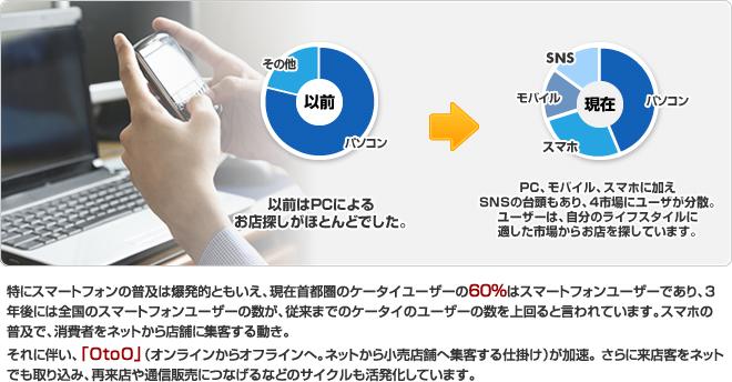
The main devices that users use websites have changed roughly as follows. 1. Computers are the mainstream 2. Smartphones and tablets are now used along with computers 3. Smartphones are the mainstream In the days when there were no smartphones or tablets, it was common to view websites on a computer. Next, mobile devices such as smartphones and tablets appeared, and as more people used them, it became necessary to support smartphones and tablets. The multi-device support that was implemented at that time was to prepare different web pages for each device, and to display pages for personal computers according to the width of the screen of smartphones and tablets. The latter method, which allows the display to fit the width of the screen, is called responsive. It is used in many sites because it can support each device with one source code. And now, smartphones are the main way to use the web. As shown in the figure below, according to a LINE survey (internet usage environment fixed-point survey in the first half of 2021), 94% of people who are actively using the Internet are using smartphones. 53% of the respondents said they only use smartphones. Today, smartphones are the mainstream environment for using websites, and many people are accustomed to the interface and speed of smartphones. Nowadays, it is easier to use a website that can be used like a smartphone even on a personal computer. At present, when it comes to multi-device support, it is a good idea to set a basic policy of “creating a website targeting smartphones”.


